Wheeler Survey Map of Yosemite Valley, 1883 in 3-D

(Source: Past Times, Past Place: GIS for History)
This map features the Yosemite Valley, drawn in 1883 by cartographers of the Wheeler Survey with government sponsorship. It is considered to be one of the first detailed and accurate maps of the area, using hachuring to show elevation change. I found this map interesting because it's level of detail makes it appear to be a work of art as opposed to an accurate portrayal for reference purposes. The great skill and precision of the cartographers is apparent. Cartography seems to have been a tedious task for early mapmakers, who lacked the technology we have today.
Historical Map of Greek and Phoenician Settlements in the Mediterranean Basin
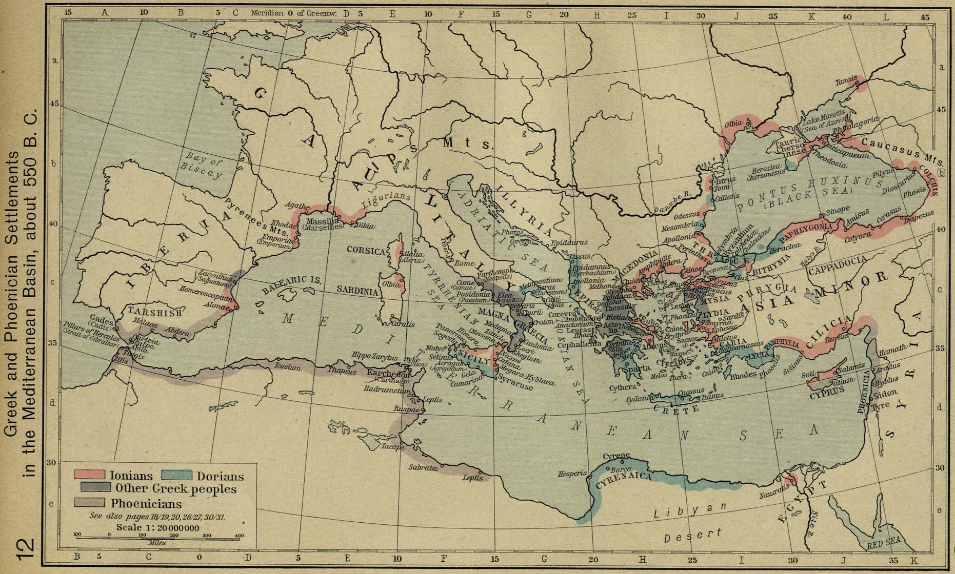
The historical map above illustrates settlements along the Mediterranean Sea and basin, circa 550 B.C. It focuses on locations belonging to the Ionian, Phoenician, Dorian, and other Greek peoples and color-codes them with a legend. The map, dated in the early 1800s, is based on information collected by historians. Therefore, it is a valid tool for reference that can be used by historians to make conclusions about the time period. I found this map appealing because it seems to have had a lot of background research put into it, even if it wasn't obtained by the cartographer. Also, it shows an area that exists today the way it was populated over two thousand years ago, and the changes and differences between the image and a modern map can be very interesting to examine. Today, most of our knowledge of history is learned through the reading of text. This item shows that a map can be a descriptive visual used to enhance our understanding of various historical events and trends.
Modified Mercalli Intensity Scale Map: Northridge Earthquake 1994

(Source: Worldlywise Wiki)
This map shows the Modified Mercalli Intensity of the Northridge earthquake in 1994. Internet users who experience an earthquake may voluntarily complete a survey on the USGS website that examines the level of shaking that was felt. Their responses are then measured to determine the severity of the quake in terms of damage and shaking, rated on a scale from I-XII. The data is then organized in various ways, such as in maps like the one above. This map was particularly interesting to me because I was living in Northridge at the time of the quake, yet I slept through it. The data indicates that the earthquake was felt enormously in my area, and I now feel fortunate that no one I know was hurt and that our home escaped major damage.